 Once again it's time to take a look at what the various Joomla template clubs have to offer.
The October 2009 templates look promising. Let's take a look at what they look like and what kind of functions they feature.
I've looked at templates from RocketTheme, YooTheme, JoomlaBamboo and GavickPro.
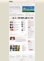
 'Infuse' from Rockettheme
Once again, RocketTheme has outdone themselves with the new template Infuse. The template comes with 6 style variations. Each of the styles have three background variations, which makes a total of 18 possible design combinations without touching the CSS. All of the settings are done from the template manager.
Some of the styles are of the usual RocketTheme type - somewhat too hyped and 'over-designed' for business use, in my opinion. This month RocketTheme have designed a few styles that are more usable for business. Lighter themes that fit better that kind of sites. Most of the RocketTheme styles look like something for a night club or recording studio ;)
The menu system used in Infuse is very nicely done. You can have up to 4 menu sublevels. You might say that's too much - but I like the fact that RocketTheme let you decide (unlike Yootheme, who think three is enough...).
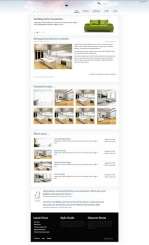
 'Strata' from JoomlaBamboo
The Strata template is a clean and delicate template from JoomlaBamboo. The company has a reputation of designing beautiful templates. Strata is no exception.
I think the template will be perfect for a real estate agency, a design house. Or anyone who want to convey a sense of style and elegance.
Strata includes the new jTweet module, which shows the latest Tweets from a given user. I also like the hidden panel which is activated with a link in the top right hand corner. The link text can be changed in the template settings. The link will only appear if you have published something into the module positions contained within the hidden panel.
With 47 module positions you will have plenty of chances to adjust the template yo your needs.
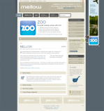
'Mellow' from Yootheme
 The October YooTheme template is called Mellow, and with good reason. It's more toned down than previous templates. The colors are nice and the design gives a soft impression. Many of the earlier YooTheme templates have been very colorful and full of contrast. 'Mellow' is easier on the eyes. Of course, this depends on what color combination you choose. The template comes with 10 different color combinations, which can be set in the template manager.
YooTheme has improved the Warp5 framework for this template. They have also released updates for previous templates to incorporate the new functions developed for 'Mellow'. The Warp framework has been used in YooTheme templates since July 2009.
 'Pulse' from GavickPro
Pulse is designed as a technology template. It's a very nicely done template from Polish template club Gavick Pro. If you have a product centric website or a portal with a lot of information, this template can fit well. The front page slideshow makes the design quite sexy.
Pulse has 29 module positions. I don't particularly like the fact that you can not have both a left and right column on the same page. You're restricted to either or.

