
Join me as I explore some of the releases - from one eye-candy to another.

'Moxy' from RocketTheme
First out this month was RocketTheme, with the template Moxy. The template follows the RocketTheme trend of being stylish and loaded with features. RocketTheme has introduced some new features in Mynx. I've already written a post about the Moxy template.
The most significant feature of Moxy is RokQuickCart, a JavaScript based shopping cart component for Joomla.
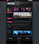 'Crystal' from YooTheme

The september template from German template provider YooTheme is called Crystal. The template is created in dark colors, and has the regular typography and styling elements of the Yootheme templates. What's new with this template is the support for multiple transparencies. You can achieve quite remarkable effects when you place transparent modules on transparent backgrounds. It comes with a selection of background color variations and you can add your own custom background images.
I don't think the pre-made themes will fit a corporate / business website, but with the proper customization it may well work. Be prepared to do some work in Photoshop, though ;) Customizing the CSS is quite easy with the YooTheme templates. Just remember to use the custom.css file so upgrades are easier to do. This goes for any template you modify, but YooTheme has provided a separate CSS file for this purpose.
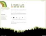 'Landscape' from JoomlaBamboo

The templates from JoomlaBamboo are always very nicely designed. The minimal design is quite different from many other Joomla templates, as they are clean and very easy on the eyes. The september template is no exception.
The design of Landscape is minimal and clean. It also has some nifty features, for instance a panel which falls down from the top of the screen (click the link in the top right corner) and a very nice slider function.
 'HitMusic' from GavickPro

The template HitMusic was actually released in late August, but I include it anyway. Hit Music is a cool template and will be useful for those who has a lot of information they want to present on the front page and in the different module positions throughout the site.
The Hit Music template has a lot of functionality. Here are some of them: Tableless design and 100% css based. 3 color themes: Red, Blue and Green. Built-in support for PhotoSlide GK3 component with Image Show template style design, support for TabsManager GK3 component for tabs content display and support for the News Show Pro GK1 module (now with new features added, with special novelty of automatic creation of thumbnails ). You can also disable the main body (main component) appearance on the front page.
What I like about the Hit Music template is that the design is very tight and well put together. The module headers are not too big and the design feels very solid. As an added bonus, the HitMusic template is delivered delivered with special 50% discount coupon for the JomSocial component.
A word about the 'SEO-friendly' layouts
Several of the template providers mention SEO friendliness as one of their key features. Both RocketTheme and YooTheme talk about their main-left-right coding approach for the HTML. This means that the actual content will appear before the left and right columns in the source code .This is beneficial for SEO. However - and this is important - both Moxy and Crystal has a LOT of JavaScript and HTML before the content section even begins. The menu in both templates take of a vast portion of the source code. This means that even if the content comes first and the left and right columns second, the content appears too far down in the source code for my taste.
For instance, in Moxy, the content appears on line 1310 in the source code (of a total of 1692 lines), and in Crystal on line 344 (of a total of 669 lines).
In my personal view this is not good enough. The developers should try and put the navigational elements below the content in the source code.