
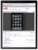
Unless you've been living under a rock, you've heard about the Apple iPad. The iPhone big brother arrived a few weeks ago, and Apple has sold a huge number of devices already.
The iPad is already a success, and as a device for consuming information it's really great.
So how does this relate to your reality as a Joomla user? In short: You need to make sure that your Joomla website works on the iPad. And not just that it works. It should be a delight surfing your website on the iPad.
As of now, the iPad is only available in the United States. So if you have a website that targets users in another country, you still have some time. There are users all over the world using iPads alreadly, though. Even the Norwegian prime minister has one. And with each day passing by, the number of iPad users will increase.
With the iPhone, Apple introduced apps, small applications which could be downloaded for free or bought through the Apple AppStore. This time around, Apple launched the iPad to a new reality: The iPad already had thousands of applications that works on it. Out of the box. And loads of developers are already releasing updates for their apps, incorporating special features and support for the iPad.
Apple has sold more than 70 million iPhones. And we have just seen the start of iPad sales. So you should definitely look into what this means for you as a Joomla website developer.
Testing your site on the iPad - without an iPad
Safari on iPad is capable of delivering a "desktop" web experience. iPad has a large, 9.7" screen and fast network connectivity, and Safari on iPad uses the same WebKit layout engine as Safari on Mac OS X and Windows. You can ensure that your website looks and works great on iPad, and even create new touch-enabled web experiences for your customers, by considering a few specific differences between iPad and other platforms.
If you have access to an iPad, you will of course test your website using the iPad. If not, you need to test your website in Safari on iPad using the iPhone Simulator (Hardware -> Device -> iPad). iPad is available in the iPhone Simulator in iPhone OS 3.2 SDK beta 2 and later, which is available to iPhone Developer Program members. In cases where it is possible to simulate iPad-like behavior in Safari on a desktop computer, instructions are given here.
1. Clean up your design
Do you have a lot of elements on your pages? Are they all really necessary? The iPad will probably cope anyway, but keep in mind that the iPad is all about consuming information. So your website should focus on transmitting information, not on fancy features.
Consider using fluid width design. Because iPhones and iPads screens are different widths depending on whether they’re turned vertically or horizontally, be sure that your website can go with the flow. You can create CSS styles for both portrait and landscape layouts or, better yet, create content that can adapt to the screen resolution.
2. Adjust the view-port
Safari on iPhone OS displays web pages at a scale that works for most web content originally designed for the desktop. If these default settings don’t work for your web pages, it is highly recommended that you change the settings by configuring the view-port. You especially need to configure the view-port if you are designing web pages specifically for iPhone OS. Configuring the view-port is easy—just add one line of HTML to your webpage—but understanding how view-port properties affect the presentation of your web pages on iPhone OS is more complex. Before configuring the view-port, you need a deeper understanding of what the visible area and view-port are on iPhone OS.
The view-port is the actual portion of the website shown by default on the iPhone or iPad. To optimize how the device shows your site, you should add the following meta tag to your template index.php file:
<meta name="viewport" content="width=device-width" />
This ensures that the site will be shown at the correct zoom level immediately, which enhances the user experience of your site.
Read more over at Apple.com
3. Finger-friendly menus
 Fancy menus are fine on a normal browser. On the iPad things work differently. The user navigates by use of her fingers. Thus, the navigation should be easy to use by pointing and tapping with the finge
Hover effects work very well for finding links with pointers, but not so well with the tactile experience of iPhones and iPads. Instead of burying links in text, design your website with larger, easier-to-identify links for simpler navigation.
4. Use conditional CSS
Use conditional CSS so that you can create iPhone OS-specific style sheets as described in “Using Conditional CSS.”
CSS3 recognizes several media types, including print, handheld, and screen. iPhone OS ignores print and handheld media queries because these types do not supply high-end web content. Therefore, use the screen media type query for iPhone OS.
To specify a style sheet that is just for iPhone OS without affecting other devices, use the only keyword in combination with the screen keyword in your HTML file. Older browsers ignore the only keyword and won’t read your iPhone OS style sheet. Use device-width, max-device-width, and min-device-width to describe the screen size.
For example, to specify a style sheet for iPhone and iPod Touch, use an expression similar to the following:
<link media="only screen and (max-device-width: 480px)" href="small-device.css" type= "text/css" rel="stylesheet">
To specify a style sheet for devices other than iPhone OS, use an expression similar to the following:
<link media="screen and (min-device-width: 481px)" href="not-small-device.css" type="text/css" rel="stylesheet">
Alternatively, you can use this format inside a CSS block in an HTML file, or in an external CSS file:
@media screen and (min-device-width: 481px) { ... }
5. Modify code that relies on CSS fixed positioning
CSS fixed positioning works in Safari on iPhone and iPad, but not as you might expect. While elements that use fixed positioning in Safari on Mac OS X and Windows always stay on screen, elements that use fixed positioning in Safari on iPhone and iPad can end up off-screen as users zoom and pan the web page. Why does this happen?
By definition, the containing block of a web page element that uses CSS fixed positioning is the view-port. This means that when you set position: fixed with a bottom and right value of 20px, you have "fixed" the position of an element 20 pixels above the bottom edge of the view-port, and 20 pixels from the right edge of the view-port.
Read more about CSS fixed positioning and iPad
6. What type of video to include?
The following compression standards are supported on the iPad:
- H.264 Baseline Profile Level 3.0 video, up to 640 x 480 at 30 fps. Note that B frames are not supported in the Baseline profile.
- MPEG-4 Part 2 video (Simple Profile)
- AAC-LC audio, up to 48 kHz
- Movie files with the extensions .mov, .mp4, .m4v, and .3gp are supported.
Any movies or audio files that can play on iPod play correctly on iPhone and iPad. Read more over at Apple.com
7. Do you need to keep the most important stuff above the fold?
When designing your website, remember the iPad can be turned around. This means that many (most) people will use the device in landscape mode. When viewing the site in landscape mode the page will normally fill the entire screen width. Which in turn means that the amount of information on the screen will be less than in portrait mode.
This can have us believe it is important to keep the most important information close to the top of the page. As I see it, it's still important, but maybe not as important as with traditional browser usage. Using a mouse to scroll either forces you to click the scrollbar or to roll the mouse wheel (if you have one). With the iPad, though, scrolling is a easy as a flick of a finger. The user will navigate the page faster and more efficiently, and consume more of the information than a normal PC user normally would. I don't have a scientific basis for this theory. It just makes sense to me. Time will tell if it holds true.
8. Code using standards
As always, it's important you create your site according to web standards. Validating HTML and CSS will get you a long way. I don't know too much about the standards compliancy of the iPad yet. If you stick to standards, you probably will be better off than creating loads of hacks and non-standard coding.
9. Flash is not a good idea

Just like the iPhone, the iPad does not support Adobe Flash technology. This is normally not a problem for Joomla users, as Flash is not part of the Joomla core output.
You might use Flash based extensions in your website, though. I try to avoid Flash as much as possible. This applies to both ads on my sites, as well as extensions for showing information (image galleries etc). I prefer choosing extensions that utilize AJAX type functionality rather than Flash.
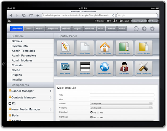
10. The Joomla admin on Apple iPad
There is no reason why the standard Joomla administrator wouldn't work on an iPad. Actually, administering your Joomla site will be a thrill on the device. Working on a Joomla site on the iPhone is not exactly fun, but on the iPad it's really good.
Some developers have created admin themes for Joomla which work really well on the iPad. One of them are the Crisp Admin template from Joomla Bamboo. Another recently released iPad-friendly Joomla Admin template is AdminPad from JoomlaPraise:
To iPad or not to iPad?
I was able to get my hands on an iPad last week. And I must say: It's a beauty!
The iPad will not prevent me from buying a MacBook Pro (which has been on my wish list for quite some time). But it might very well be that extra gadget which makes it into my home :)